
This page looks harmless, right? But it gave me a bit of trouble at first. I’m pleased with the end result, though.
Here are the facts about this layout:
- When I first started working on this layout, I used only patterned paper. It all coordinated but ended up being a bit too much. Once I switched out my base layer for white cardstock, it came together much better.
- Here’s the sketch I ultimately decided to go with for this page.
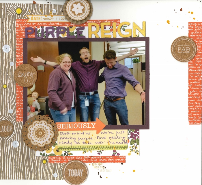
- My wingman came up with the title. Since this page is about people wearing purple, it seems quite appropriate.
- This page is my entry in Shimelle’s challenge to use woodgrain patterned paper.
- I have a difficult time using cork and other kraft elements on my page, so I’m delighted I was able to overcome this and embrace the brown.
If you want to see how this layout started, check out the process video. I think it’s interesting to see how it started and where it ended up.
very cool, love the pp’s and the change…and you HAND cut!!!
What a fun layout and title.
Great layout with a lovely sense of fun.
Gorgeous layout. Love the cork, the colors, the design and the journaling!!!
Terrific layout! That picture is really fun and cute 🙂 Really like that woodgrain paper!
Great job!
Fun to see where you ended up with your layout! Love the final result.